This is going to be a difficult post to write on several levels. I’m about to lay heavy blame on a number of people and organisations who are part of my loyal customer base. I am also going to incriminate the industry I work for, which includes my direct employer and —of course— myself.
At the same time I have to marshal my arguments very carefully so as not to belittle a specific individual whose work I am about to dissect and critique in a harsh tone. I firmly believe —although he probably doesn’t agree with me— he is the victim of the twin evils of underinformed educators and overeager, heedless software companies. I wish neither to patronise nor scapegoat him and I know that cushioning language is not my strong suit. Please remember this while reading the text below. This is not about ridicule, but rather about a pervasive and alarming world-wide trend in academic architecture.
I’d like to thank ███████████ for sending me his work and having the courage to allow me to publicly critique it, knowing I’d focus only on the bad and not the good.
Also my sincere thanks goes out to K. who —unlike me— did receive proper academic training during her time at University (Turku University, Department of English) and was able to comment comprehensively on the scholarly and academic aspects of this critique.
…..
A few days ago ██████ sent me a PDF containing his submission to a design course at his university. I do not know which university, nor which semester this exercise belongs to. What I do know is that it is very similar in style and approach to a lot of student work. I am not accusing anyone of plagiarism here, I’m merely pointing out that there are parallels between this particular project and many other ones I have seen over the past decade or so, starting from my time at TUDelft throughout my subsequent career. Hence, while my criticisms will be focused on this particular publication, they should be interpreted within a much wider context.
The driving motivation of this wider context is a certain institutionalised yearning for recognition (let’s call it Akzeptanzsucht as there is a rich history for awarding German terms to psychological dysfunctions). Architecture as a whole is often associated with scientific and technological faculties such as mathematics, material science, engineering, physics and electro/computer science. However within that group there is an undeniable disdain towards architecture. Architects —it is felt— are exhibitionist bullshit artists who rationalise their work with vacuous language. Even though that is certainly sometimes true, it is also the case that we architects have our own vocabulary which may sound as ridiculous and vacuous to a physicist as a discussion about the Higgs field may sound to us.
But I think it cannot be denied that there exists a trend within academic architecture to incorporate scientific elements into the design methodology. There is nothing intrinsically wrong with this, indeed many an important scientific insight has been the result of cross fertilisation between two fields of study, but the prerequisite is that one is proficient in both fields. Applying the teachings of graph theory to infrastructure will only result in worthwhile outcomes if one understands both graph theory and infrastructure. However in our desperation to be taken more serious as a scientific discipline, we have become too eager to appropriate the terminology and modus operandi of fields we do not understand. Physics, mathematics and biology especially have their jargon pilfered at an alarming rate.
There is another problem which cannot be blamed on the rise of computational design. If you want to publish papers with a scientific inclination, you have to know what constitutes proper writing. Cite your sources, define your terms (ideally always but especially if you award them unconventional meaning), number your pages and include a table of contents, number or otherwise identify your illustrations, proper use of introductions and conclusions, proper use of language and on and on. I was never taught this at TUDelft and it was —in my opinion— a criminal omission from the curriculum.
…..
I’ve reproduced a subset of the pages of the original publication. I have omitted some of the graphics, but none of the text. Each picture will be followed by a set of questions and remarks pertaining to that page. If you are an architecture student or teacher I recommend looking at the images first and only reading my comments second. Click on each image to see a larger version.
Cover Page; Associative Networks
The first page in the publication is a reasonably typical cover. It contains the name of the author (though not the university affiliation, semester, course code or date), the title, an image presumably pertaining to the project and a logo. The image is not credited so I’ll assume it is the authors own work. It does not re-appear anywhere else in the document, nor is there any description or explanation for what it means. Is it an example of “Associative Networks”? It seems to be only a single network made up of the edges of a Voronoi diagram, so probably not. However we can skip over it as it is just the title image and I’ve seen much worse cover designs in my time.
Page 1; Introduction
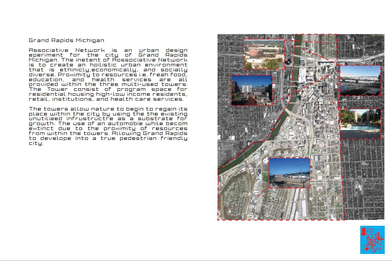
This page contains the introductory text for this document. It outlines the character of the location and what the design is supposed to accomplish. The choice of font is awkward. If we are meant to read this, why not present it in an easy-to-read typeface? I’ve reproduced the text here in case you prefer the use of your eyes later on:
Grand Rapids[1] Michigan
Associative Network[2] is an urban design eperiment[3] for the city of Grand Rapids[4] Michigan. The inetent[5] of Aossociative[6] Network is to create an hoilistic[7] urban environment that is ethinicly[8],[9]economically, and socially diverse. Proximity to resources i.e. freah[10] food, education, and health services are all provided within the three multi-used[11] towers. The Tower[12] consist of program space for residential housing[13] high-low income residents, retail, institutions, and health care services.
The towers allow nature to begin to regain its place within the city by using the the[14] existing unutilized[15] infrustructre[16] as a substrate for growth. The use of an automobie[17] while[18] becom[19] extinct due to the proximity of resources from within the towers.[20] Allowing Grand Rapids to develope[21] into a true pedestrian friendly city.
- Punctuation error: missing comma between city and state.
- “Network” is used as a singular in the text, but it was plural on the cover page.
- Spelling error: experiment
- Punctuation error: missing comma between city and state.
- Spelling error: intent
- Spelling error: Associative
- Spelling error: holistic
- Spelling error: ethnically
- Punctuation error: missing space
- Spelling error: fresh
- What does this mean? Was it supposed to be “multi-usage“, “mixed-use“?
- Spelling error: towers
- Punctuation error: missing comma
- Typographical error: “the” appears twice
- Awkward choice of words, “unused” would have been better
- Spelling error: infrastructure
- Spelling error: automobile
- Typographical error: “while” should have been “will“
- Spelling error: become
- Punctuation error: period should have been a comma.
- Spelling error: develop
The bulk of these errors could have been avoided by using a spell checker. There is no excuse —none whatsoever— for not using a spell checker. I shall refrain from commenting on the content of the text at this point in time. A number of fairly grand statements and promises are made but I’ll return to that later.
The images on this page lack credits. Were the photographs taken by the author? If so, they were probably not taken on the same day given the varying weather. Where did the aerial photograph come from? Google Maps? What is the scale of this overview? How up-to-date is this data?
However sources and citations and credits are superficial absences. There is a more fundamental problem with this introduction. An architectural design differs in a number of ways from a typical research paper but there are certain requirements that both need to fulfil in order to qualify as an academically acceptable publication.
- Firstly, every publication should have one or more research questions; what is it you’re going to investigate? Each question needs a justification that will convince the reader that the problem is indeed real and relevant. If the assignment awards you a research question you can ask your teachers to supply this justification.
- Secondly, you need to outline your approach. How are you going to answer your questions? What data is needed and how will you go about processing this data?
- Thirdly, you should be aware of all the things that could go wrong and transmit that awareness in your publication. What assumptions are you making that could invalidate your conclusions? Is there a way to test whether this happened? If you do find answers, how generic will they be? Under what circumstances can your conclusions be applied to other problems?
- Lastly, what new knowledge or methodology will you contribute to the field? Remember that this is not an exercise or test, it’s a design/research project. Will you test the efficacy of a new methodology you’ve (co)developed? Will you test the efficacy of an existing methodology in a new setting?
The above are the non-negotiable baseline requirements for anyone who wants to play ball in academia. Your institution should have a style sheet that lists all the requirements and guidelines for a publication. If there is none, talk to your dean or faculty committee. If they’re not interested, try to enrol in a university where they take an academic approach to architecture seriously.
Page 2; Demographics
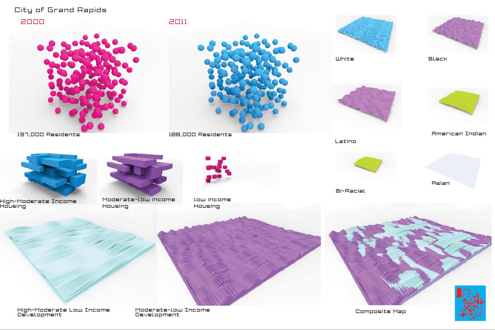
Like before, there are no page-numbers. Here we are confronted with some statistics regarding the population demographics of Grand Rapids. There is no source listed for these statistics. We are told that from 2000 to 2011 the population shrank by 9,000 people. This is interesting information, after all cities tend to get bigger over time, not smaller. Despite the obviousness of this fact there should still be a reason for stating it. What do these numbers mean within the context of this project? There are a number of follow-up questions that immediately spring to mind, such as:
- Did the population start shrinking in 2000, or was the peak sometime before or after?
- Is the decrease consistent, or is there a wavy component?
- What was the growth rate before the numbers started falling?
- How does this change compare to other cities in the area and other cities around the country?
- What was the influx of people during the same time? 9,000 people leaving and zero people moving in is not at all the same as 39,000 people leaving and 30,000 people moving in.
- Where did people move to? Or is the difference attributable to deaths?
- What reasons were there for moving?
- Were the people who moved out a representative group for the population at large, or were they significantly younger/older, richer/poorer then those who stayed? In other words, how did the exodus affect the demographics?
- How has the cost of living changed during the same period?
- What about unemployment?
- What about government investment in this area?
Unfortunately none of these are asked, let alone answered. Statistics are important, but they are not an end in themselves. They only serve as a means towards a greater understanding.
The graphics accompanying these two numbers are peculiar. They are almost identical, except that there are slightly more blue spheres. Why does the lower number have more spheres? Are these 3D-plots? If so, where are the axis labels? Are they supposed to be visual accompaniment for the numbers? If so, is the fact that they look so strikingly alike supposed to convey that the change in population is not significant? Then why mention it at all?
The three images underneath are about housing with respect to income. But again, the images lack an explanation. If they are plots, where is the data? Where are the sources? Why is “low income Housing” so very different from the other two? If this page is about the current state of Grand Rapids, am I to conclude that low-income housing is an infinitesimal part of this city? That doesn’t mesh with what I know about cities in the Michigan area.
The six images in the upper right presumably represent racial factions in the city. But are these from 2000, 2011 or some other data set? Is the area of each wavy surface representative of the number of individuals affiliated with a specific racial category? If so, why not also provide the numbers rather than make me guess the differences in area? What do the waves mean? What do the colours mean?
Lastly, the three images along the bottom have something to do with development related to income groups. On the left we find the “High-Moderate Low” (which seems to cover all groups mentioned in this publication) and in the middle the “Moderate-low” group. There are waves on these rectangles and shapes on the waves, but no explanation as to what either of those mean. The project region did not appear particularly rectangular on the previous page, so this is either an abstract representation of development or it’s a partial representation which can be tiled to fill a larger area. If it’s abstract, what meaning do we derive from the “Composite map“? Is this showing us how high and low income development will be intertwined in the design? Probably not as the other images on this page are all about the current situation, rather than the design proposal.
Page 3; Homicide & Institutions
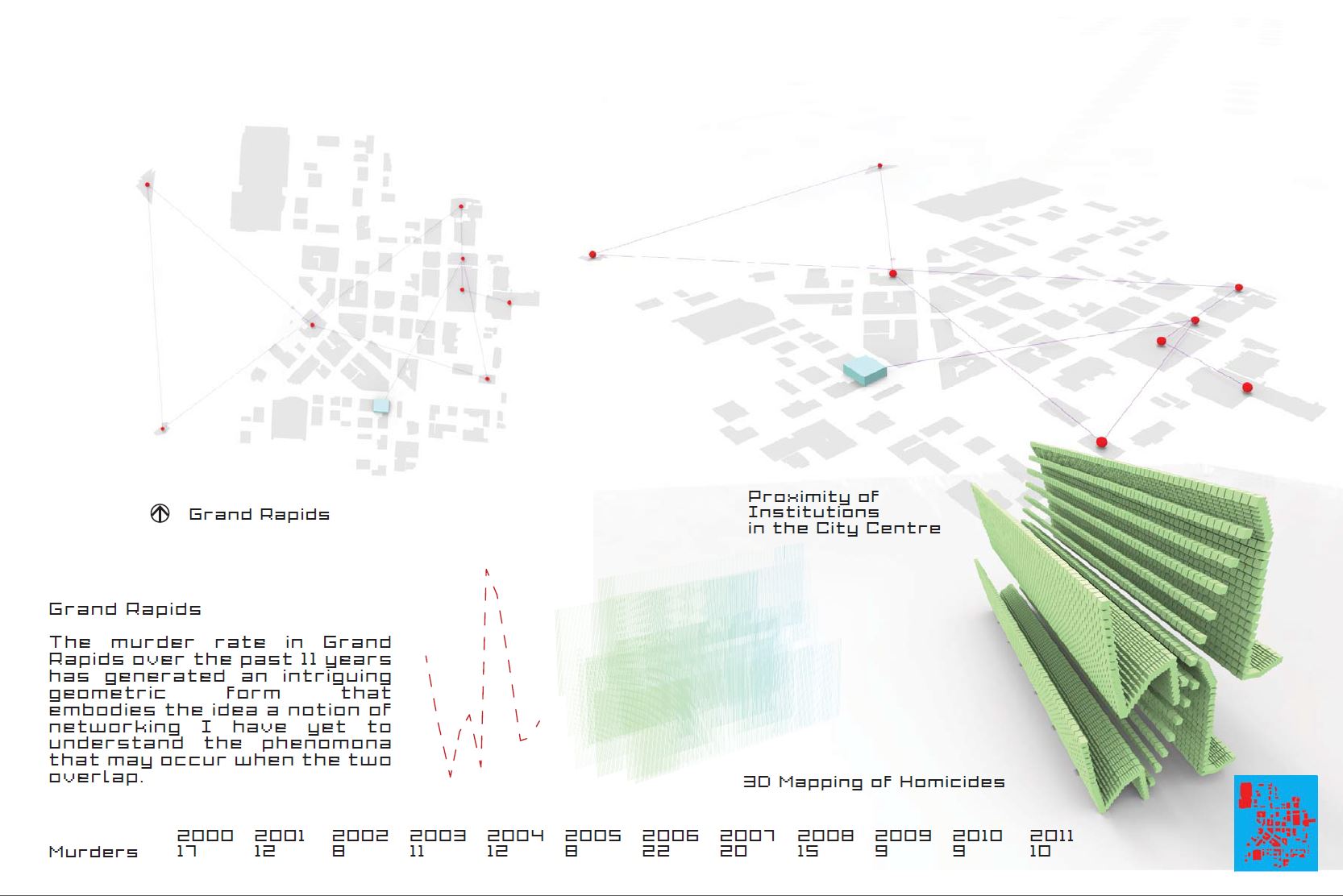
The second important piece of analysis concerns the murder rates in Grand Rapids, again measured over the 2000~2011 period. The top half of the page does not seem to be related to this though as it seems to be a map with “institutions” on it. I do not know which institutions these are (law-enforcement, health-care, government, education?) but all of them are connected into a single graph. However not every possible connection is made, or indeed even every nearest connection. Some institutions have a valence of only one, the most heavily connected institution has a valence of four. What do the connections mean? What is the blue box and why is it different from the red dots? Why are we shown the same image twice, once in plan view and once in perspective? When “proximity” is mentioned, what sort of proximity? The graph seems to indicate a Euclidean distance measure. Why not measure the distance in terms of actual travel distance? Or travel time?
The murder rate statistics (again no sources!) are described as “intriguing” (or at least as generating an “intriguing geometric form” when graphed). What is intriguing about it? Is it different from murders committed elsewhere in the country? If so, how? Are there more or fewer murders than expected, or are the numbers more variable than expected? Were these murders committed everywhere in the area or did the location of the institutions affect the local rate?
What significance can be assigned to the geometric form of the graph of these numbers? A 2D graph is supplied, presumably with the time along the x-axis and homicide count along the y-axis. But again no axis labels or scales. Then another graph is drawn called the “3D Mapping of Homicides”. It is not in fact 3D, it’s merely the two-dimensional graph extruded in the third dimension. This operation does not add any new information. I think the mathematical term “mapping” is also used erroneously here. Why is the same graph drawn twice in the right-most image?
Page 4; Artist’s impression
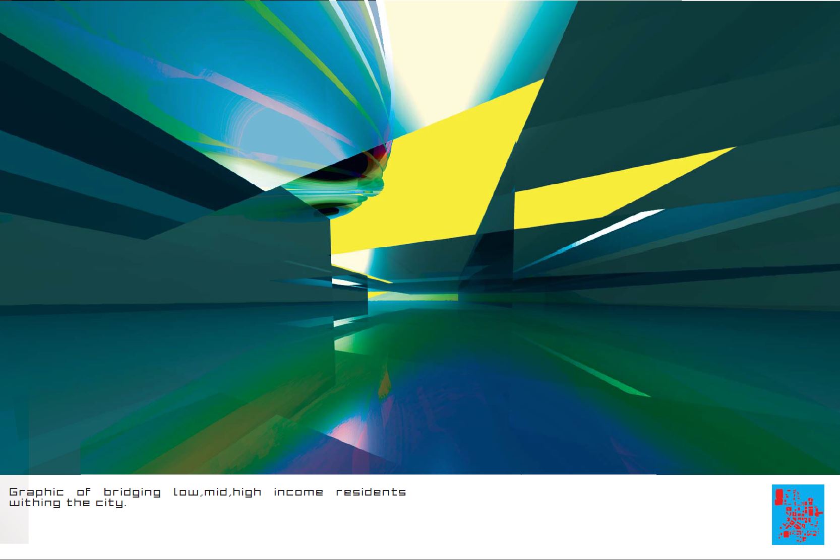
A very colourful interlude representing the “bridging [of] low, mid [and] high income residents”. I can’t really work out what I’m looking at. Is this an abstract or a physical model? If it’s physical, how does one bridge residents? Not much I can say about this image except that I’ve seen many like it and not just in academia, but also in professional architecture. Extreme perspectives, transparency, reflectivity and an unfamiliar colour palette are combinations that would make any image hard to read and yet many architects seem partial to this style.
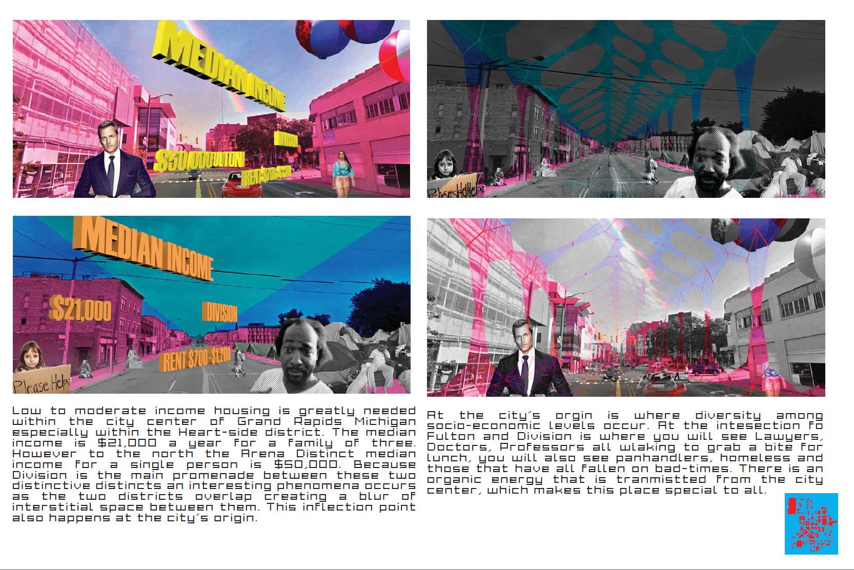
Page 5; Income disparities
I’ll reproduce the text again, this time with ~25 spelling and typographical errors fixed up front:
Low to moderate income housing is greatly needed within the city center of Grand Rapids, Michigan, especially within the Heart-side district. The median income is $21,000 a year for a family of three. However to the north the Arena district median income for a single person is $50,000. Because Division Ave. is the main promenade between these two distinctive districts, an interesting phenomenon occurs as the two districts overlap creating a blur of interstitial space between them. This inflection point also happens at the city’s origin.
At the city’s origin is where diversity among socio-economic levels occurs. At the intersection of Fulton St. and Division Ave. is where you will see lawyers, doctors and professors, all walking to grab a bite for lunch. You will also see panhandlers, the homeless and those that have fallen on bad times. There is an organic energy that is transmitted from the city center, which makes this place special to all.
Images and text like these are very familiar to me from my time at TUDelft. Indeed I have myself made very similar presentations in a dark and murky past. Although I have some issues with this page, they do not stem from the Akzeptanzsucht. Instead I’d like to take this opportunity to talk about academic substance.
When one presents a design or research finding it is always intended for an audience. This audience grants you a limited amount of time and attention for you to make your case. In effect, the audience is doing you a favour. It is therefore bad form to present your case in an inefficient manner. Either by not sticking to the topic, or by providing vague content, or by providing difficult to access content, or by providing redundant content. We’ve already touched upon type-face selection and the reason you should pick an easy-to-read font is simply an act of politeness towards your audience. Correct spelling is another aspect of this, as is clear language. The meaning of terms such as interstitial space, inflection point, city’s origin and organic energy is not immediately obvious. One should either avoid these expressions in favour of more common ones or a proper explanation has to be forthcoming. Colloquialism and low register language should also be avoided in academic texts.
The images on this page are also very difficult to access. The text —especially the yellow kind— is difficult to read. It’s not particularly clear why these words and numbers have been inserted into the pictures. It is also not clear to me why the images have been overlaid with strong colours and cut-out people. Is the insertion of beggars there to emphasise the poverty of the area? If so, why pick Charles Ramsey who is from Cleveland and not destitute? Or Harvey Specter for that matter, who is from New York and fictional. Why not use actual photos of actual locals and include some conversations/interviews to see if they all share the notion that the intersection of Division Ave. and Fulton St. is “special to all”? I can’t help but feel that this —all too common— portrayal of local communities as a set of photoshopped people and coarse statistics is doing us a severe disservice. We reduce actual problems to caricature ones, opening the door to solutions that are little more than platitudes.
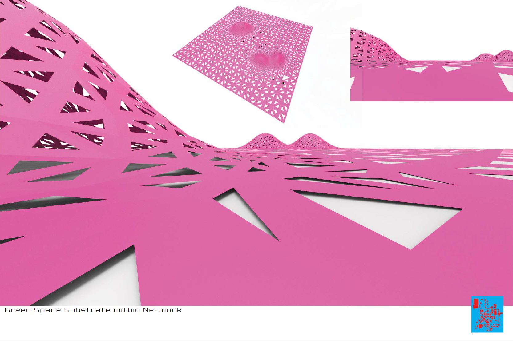
Page 6; Pink
This is where it gets weird. The mathematics of geometry is a broad field and a lot of the stuff in it is complicated. Programming is difficult and it takes a long time to get something up and running. Back when you had to write your own algorithms from scratch there was an incentive to not be frivolous about it. You don’t want to spend a week writing a piece of code that wasn’t going to pay off. Now however it’s easier and easier to call high-level functions and make a geometrically involved algorithm in just a few minutes. This is typically known as “progress”, but there’s a dark side too.
The image above represents what the author calls “Green Space Substrate within Network”. I know what all those words mean but the only two I can put together are “green” and “space”. A green space in an urban plan is presumably where we find an above average amount of plants and trees. Perhaps just a tree-lined avenue, maybe even a park. Different sciences use different definitions for the term “substrate”, but in general it tends to refer to the bottom layer of a system. The word substrate has been used before on page 1 where the existing infrastructure was designated as a substrate for green growth. I can sort of see the sense in that, but the image on this page doesn’t seem to have anything to do with the existing infrastructure of Grand Rapids. I can probably venture a couple of guesses of how the pink shape translates into an architectural design but that really is the responsibility of the author.
“Substrate” is exactly the sort of word that lends itself for absorption into a vocabulary designed to impress and obscure. Substrate today is pretty much where Voronoi diagrams were ten years ago. They were new, hard to come by and sounded decidedly mathematical. But over time the Voronoi diagram became more and more common and today it is a by-word for cliché and triteness.
The page provides three views of the same shape. Two of these are pointless as they neither provide a good overview nor greater detail. It appears that what we are looking at is a surface which has been affected by three point-attractors. This surface was subsequently triangulated using a refinement algorithm and ultimately the triangles were offset to create a collection of triangular holes. What does this shape mean? Your guess is as good as mine. The geometry and topology of the shape are complicated, but this complexity exists in a vacuum. It didn’t come from the design parameters or the city data and since it doesn’t represent an actual designed shape to be constructed it will not feed back into the design either.
Finally, if this represents green space, why is it pink?
Page 7; Putting it all together
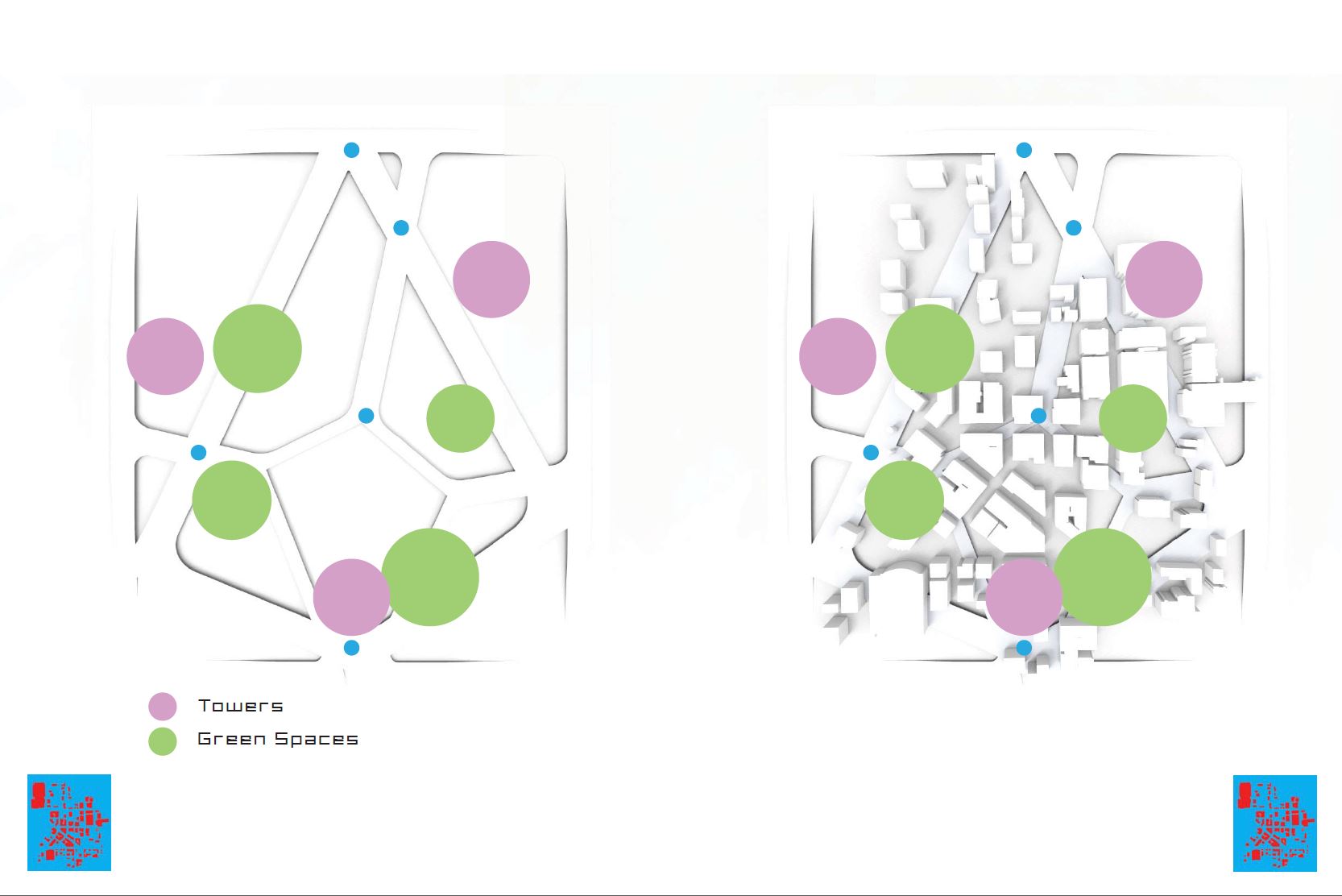
At this point individual properties seem to be behind us and we’re presented with an image of both buildings and green space as they appear together in this project. There are three locations where towers will be constructed and four areas are designated as “Green Spaces”. Never mind that the distribution of green dots is completely different from the pink bulges on the previous page. The locations of both purple and green dots are not justified, or —if they are— those justifications have been omitted. They seem to intersect the existing built environment in awkward ways. There is no scale, no north direction, no explanation of what the blue dots are or indeed what the network of (presumably) wide thoroughfares is supposed to accomplish.
As far as I’m concerned the entire publication should have been a build-up to this image, but all the tangent narratives about population, income disparity, racial distribution, homicides, institutions, interstitial spaces and substrates are nowhere to be found. How do three giant towers improve this environment? How do they worsen it? What will it cost to build and maintain? What will it generate in terms of housing, income and growth?
The rest is silence.
…..
Before I wrap this up, I’d like to re-iterate that the above critique was not meant as an attack on an individual piece of work. ██████’s presentation served merely as proxy to a lot of presentations I have seen over the past 10 years. As mentioned, I’m not aware of the context of this work; what the brief was, how much time was allotted, which semester it represents. In a way it doesn’t matter. Students of architecture will get inspiration from the world they are immersed in. If teachers will not teach them, they have to look at other student work. But trying to extract a working methodology from other presentations leads inevitably to cargo cult architecture where abstract graphics and physical geometry are treated interchangeably, where unclear vocabulary serves as a stand-in for logic, and where complexity masquerades as information. Blame lies with the likes of me who provide the short-cuts and buzzwords that poison the scene, and blame lies with teachers who should have taught students what it means to be an architect rather than an artist.
Finally, I’d like to restate my criticisms in general terms. If we are serious about moving architecture and urbanism away from purely artistic considerations and into a more rational arena, there has never been a better time than now. All of us have access to immense computational power which can be applied to problems that have been —until quite recently— intractable. But of course the garbage-in-garbage-out adage holds true; computation can be used to generate large amounts of complexity, but complexity does not equal worth. The only time when it makes sense to invoke computation in the design process is when there is some relevant data that needs to be computed.
On two occasions I have been asked, “Pray, Mr. Babbage, if you put into the machine wrong figures, will the right answers come out?” … I am not able rightly to apprehend the kind of confusion of ideas that could provoke such a question.
Charles Babbage, 1864
Students ought to get instruction about algorithm design and computational geometry, but equally important is that they are taught about the ethics of computational design. What sort of problems warrant computation? How should this be presented to an audience? How reliable are the computed results? What simplifying assumptions were part of the algorithm? What will it require to get a better answer? If these questions aren’t asked in your curriculum, someone isn’t doing their job.
In the end, designers have to be able to justify every single line of code and every single sentence and every single image and every single statistical data-point. If there is no justification, then nobody can be expected to take the results seriously.

Leave a reply to ayg011 Cancel reply